Wedding Color Palette Ideas to Match Your Venue
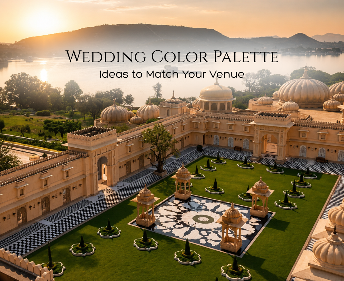
Choosing a wedding color palette is one of those decisions that quietly shapes everything else — your flowers, your linens, your invitations, even your outfit choices. But the palette that looks stunning in a Pinterest board doesn’t always translate to your actual venue. A muted pastel scheme can disappear against a stark white banquet hall, while a bold jewel-tone palette might overwhelm an already ornate heritage property. This guide walks through how to choose wedding color themes that genuinely work with your venue, not against it.
Related: Explore Our Full Wedding Planning Services
Why Your Venue Should Decide Your Wedding Color Palette
Most couples pick their wedding color direction before they’ve fully considered their venue’s existing architecture, lighting, and finishes — and then spend the rest of planning fighting against a mismatch. A venue with warm wood tones and natural stone calls for an entirely different palette than a modern glass-and-white banquet space. Before finalising any wedding color palette ideas, walk your venue (or study photos of it) specifically looking at wall colour, flooring, lighting temperature, and any fixed architectural details you can’t change.
Matching Wedding Color Themes to Venue Type
Heritage Palaces and Havelis
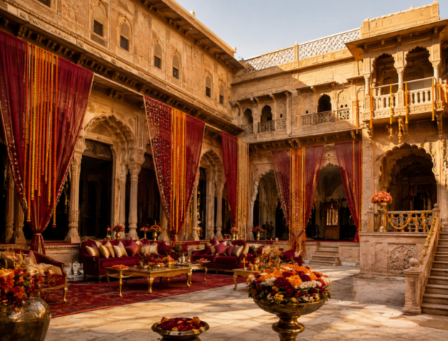
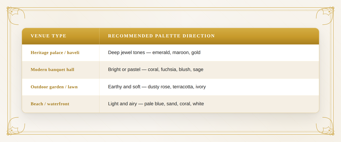
Rich, ornate venues with intricate stonework and warm lighting pair best with deep, saturated wedding color combinations — emerald, maroon, gold, and burgundy all hold their own against detailed architecture rather than getting visually lost in it.
Modern Banquet Halls and Hotels
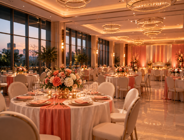
Clean, contemporary spaces give you the most flexibility. Bright, colorful wedding colors — coral, fuchsia, cobalt — read beautifully against neutral modern backdrops, as do softer bridal color schemes like blush and sage if you want something more restrained.
Outdoor Garden and Lawn Venues
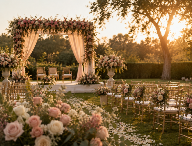
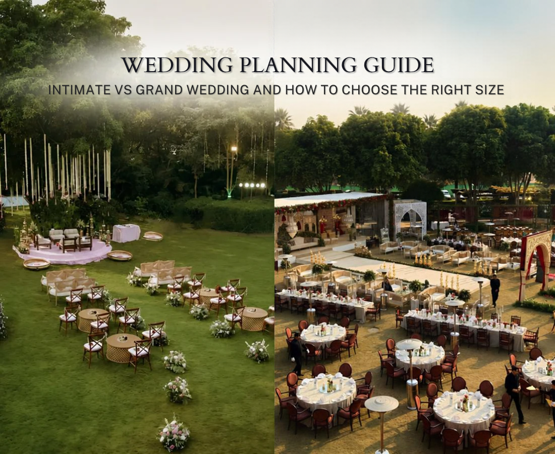
Natural greenery is already doing a lot of the visual work, so your wedding color schemes should complement rather than compete with it — dusty rose, ivory, terracotta, and soft yellow all sit well against a garden backdrop without needing to fight the existing greens.
Beach and Waterfront Venues
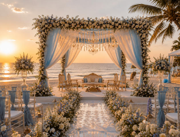
The natural blues and neutrals of a coastal setting call for a lighter touch — pale blue, sand, coral, and white-based wedding color palette choices tend to look most intentional here, since darker or heavily saturated palettes can feel out of place against open sky and water.
Best Wedding Color Combinations by Season
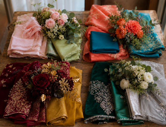
Some of the most reliable best wedding color combinations map naturally to season, though there’s no strict rule requiring you to follow this:
- Spring: Blush pink and sage green, or lavender and ivory
- Summer: Coral and turquoise, or fuchsia and gold
- Autumn: Burgundy and mustard, or terracotta and deep green
- Winter: Emerald and gold, or navy and silver
These good wedding color combinations work well because they echo the natural palette already present outdoors during that season, which is especially useful for venues with significant outdoor or transitional space.
Choosing Bride and Groom Color Combinations
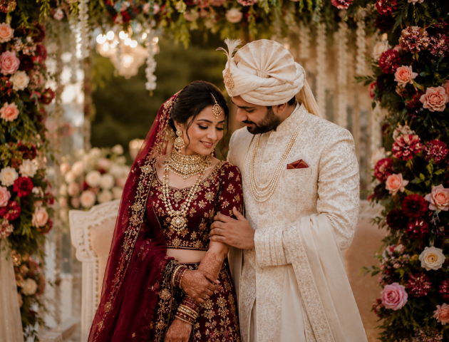
Beyond décor, many couples also want their outfits to feel coordinated without being identical. Popular bride and groom color combinations include:
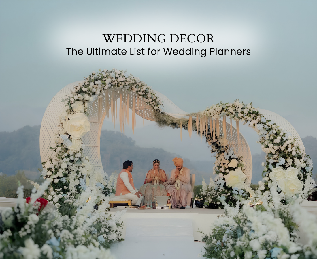
- A bride in a bold jewel tone with the groom in a complementary neutral (cream or ivory sherwani against a deep red or emerald lehenga)
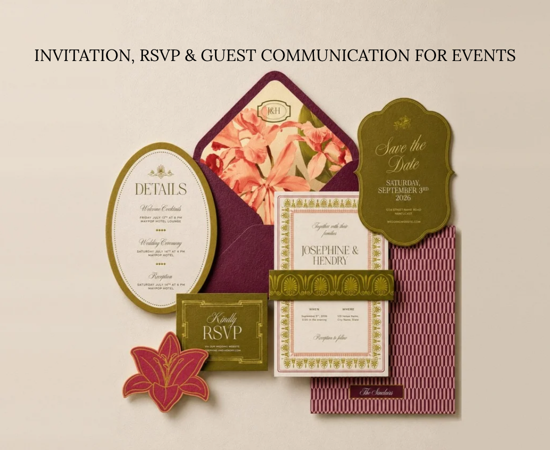
- Matching bridal colour schemes across the couple’s outfits and the stage backdrop, so photographs feel cohesive rather than accidental
- Contrasting but harmonious tones — the bride in blush, the groom in a deeper rose or maroon — rather than matching exact shades, which can read as overly literal in photos
Building Your Wedding Decor Color Combinations
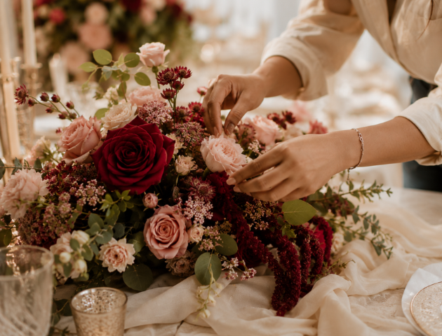
Once your core palette is set, apply it consistently across every layer of décor:
- Primary color — used for the largest visual elements: florals, drapery, mandap or stage structure
- Secondary color — a complementary tone used for accents: table runners, chair details, signage
- Neutral base — ivory, white, or beige used to prevent the palette from feeling overwhelming, especially across multi-day functions
Consistent wedding decor color combinations across every function — haldi, mehendi, sangeet, and the wedding itself — help the entire celebration feel like one cohesive story rather than a series of disconnected events, even when each function has its own distinct mood.
How to Test Your Palette Before Committing
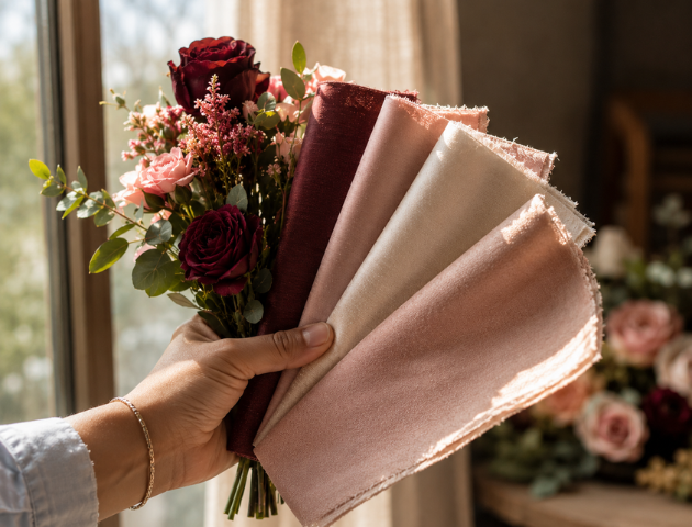
Before finalising any palette color wedding decisions, request physical fabric swatches and floral samples from your decorator rather than relying on screen colours alone — digital renders and printed swatches can look meaningfully different under your venue’s actual lighting. According to color theory research from Pantone’s Color Institute, perceived color shifts significantly under different lighting temperatures, which is exactly why a palette that looked perfect on your laptop can feel off inside your actual venue.
Quick Reference: Wedding Color Palette by Venue
Frequently Asked Questions About Wedding Color Palettes
How do I choose a wedding color palette that works with my venue?
Start by studying your venue’s existing wall colour, lighting, and fixed architectural details, then choose a wedding color palette that complements rather than competes with what’s already there.
What are the most popular wedding color combinations right now?
Emerald and gold, blush and sage, and coral and turquoise are among the most requested wedding color combos currently, though the right choice always depends on your specific venue and season.
Should bride and groom color combinations match exactly?
Not necessarily — many of the most photogenic bride and groom color combinations use complementary or contrasting tones rather than identical shades, which tends to read as more intentional in photographs.
Do I need different color schemes for each wedding function?
Not required, but many couples choose a consistent core palette with function-specific variations — for example, brighter wedding color themes for haldi and mehendi, with a more refined version of the same palette carried through to the main ceremony and reception.
Explore More from ConnectX Events
→ Our Services: Discover our full range of luxury wedding and event planning services
→ Get in Touch: Book a free consultation with our wedding planning team
→ Read Next: HOW TO CHOOSE THE RIGHT WEDDING PLANNER IN INDIA
Final Thoughts
The best wedding color palette isn’t the one that looks best in isolation — it’s the one that feels inevitable once you see it inside your actual venue. Study your space first, choose a palette that complements its existing character, and carry that same colour language consistently across every function for a celebration that feels considered from the first photo to the last.
Found this guide helpful? Share it with a couple who’s still deciding on their colors.